A First Step Into a Larger World
MoMA's first exhibition devoted to information design is right about its subject and wrong about its scale.

Installation view of Kate Crawford and Vladan Joler, Calculating Empires: A Genealogy of Technology and Power Since 1500, 2023, in Full Disclosure: The Edge of Information Design, Museum of Modern Art, New York, 2026. Photograph by Elmer Yglesias. © Elmer Yglesias for the photograph; underlying artwork © Kate Crawford and Vladan Joler. Used here for commentary and criticism.
The first thing I stopped in front of at MoMA was a set of colored stripes. Ed Hawkins's Warming Stripes renders annual global temperature measurements from 1850 forward as vertical bands shading from blue into red, and it carries no axes, no labels, no numbers and no explanatory prose anywhere on its surface. Everything a conventional climate chart uses to establish its own credibility has been stripped out, and the information survives the removal intact. Standing there, I found myself asking the question the rest of the gallery keeps raising in one form or another: when information takes visual form this cleanly, where does design end and art begin?
Full Disclosure: The Edge of Information Design opened two days ago (September 27) in MoMA's free street level gallery and runs through June 13, 2027. Organized by Paola Antonelli with Jules Bernstein and Forrest Pelsue, it is the museum's first exhibition devoted entirely to information design, and it gathers 30 digital and analog works, six of them new acquisitions. MoMA's own framing treats information designers as reporters and translators who offer sourced, specific visual accounts rather than absolute truths, at a moment when confidence in institutions and in the numbers they produce has thinned considerably.
The range on display is the exhibition's real accomplishment. Giorgia Lupi and Stefanie Posavec's Dear Data turns a year of hand drawn postcards into an argument that personal data can be intimate rather than extractive. Kate Crawford and Vladan Joler's Calculating Empires runs in the opposite direction, mapping five centuries of technology and power at a scale no single viewer can absorb in one pass. Josh On's They Rule lets visitors trace interlocking corporate board memberships, Fernanda Viégas and Martin Wattenberg's History Flow exposes the editing wars behind Wikipedia entries, and Ben Fry's genomic images treat three billion letters of genetic code as a legitimate subject for visual composition. Taken together, the works establish that information design is already far more than charts and dashboards, which is exactly what a first exhibition on the subject needed to prove.
My judgment is that MoMA has the subject right and the scale wrong. The claim the exhibition advances, that information design belongs in an art museum on its own terms rather than as an annex to graphic design, is correct and overdue. The room in which that claim gets made cannot carry it. Everything that follows is a consequence of taking the first half of the argument seriously, because once you accept the premise, the history stretches much farther backward and the artistic possibilities extend much farther forward than 30 works can show.
The ancestors already in the room
MoMA has not ignored history, and the clearest evidence sits inside the show. William Villalongo and Shraddha Ramani's Printing Black America: Du Bois's Data Portraits in the 21st Century reworks the visualizations W.E.B. Du Bois and his collaborators prepared for the 1900 Paris Exposition. The full project consolidates 65 original Du Bois visualizations into 30 prints across six thematic portfolios, produced with printmaking studios in six cities, and MoMA's acquisition draws from the first portfolio, where gravure and screenprint carry a cut and pasted reproduction of a Du Bois portrait directly into the contemporary work.
The inclusion complicates any easy complaint that the exhibition lacks a past, and it raises a better curatorial question instead. If the contemporary prints acquire much of their force through their relationship to Du Bois, why should visitors meet the ancestor only through the descendant? A more expansive show could place original Du Bois material, or archival reproductions where originals cannot travel, beside the reinterpretations, and let people see continuity and transformation in the same sightline rather than reading about one and looking at the other.
Push back further and the same logic reaches Charles Joseph Minard. His 1869 Carte Figurative of Napoleon's Russian campaign compresses army size, geography, direction of march, elapsed time and temperature into one composition whose narrowing band turns catastrophic losses into something you grasp before you can explain it. The École nationale des ponts et chaussées in Paris holds the most complete collection of his graphic work, with additional sheets at the Bibliothèque nationale de France, and I have no information about whether MoMA approached anyone. What interests me is the thought experiment. Enter Full Disclosure through Minard and Hawkins stops looking like a contemporary innovation and starts looking like the latest entry in a tradition generations older than the computer.
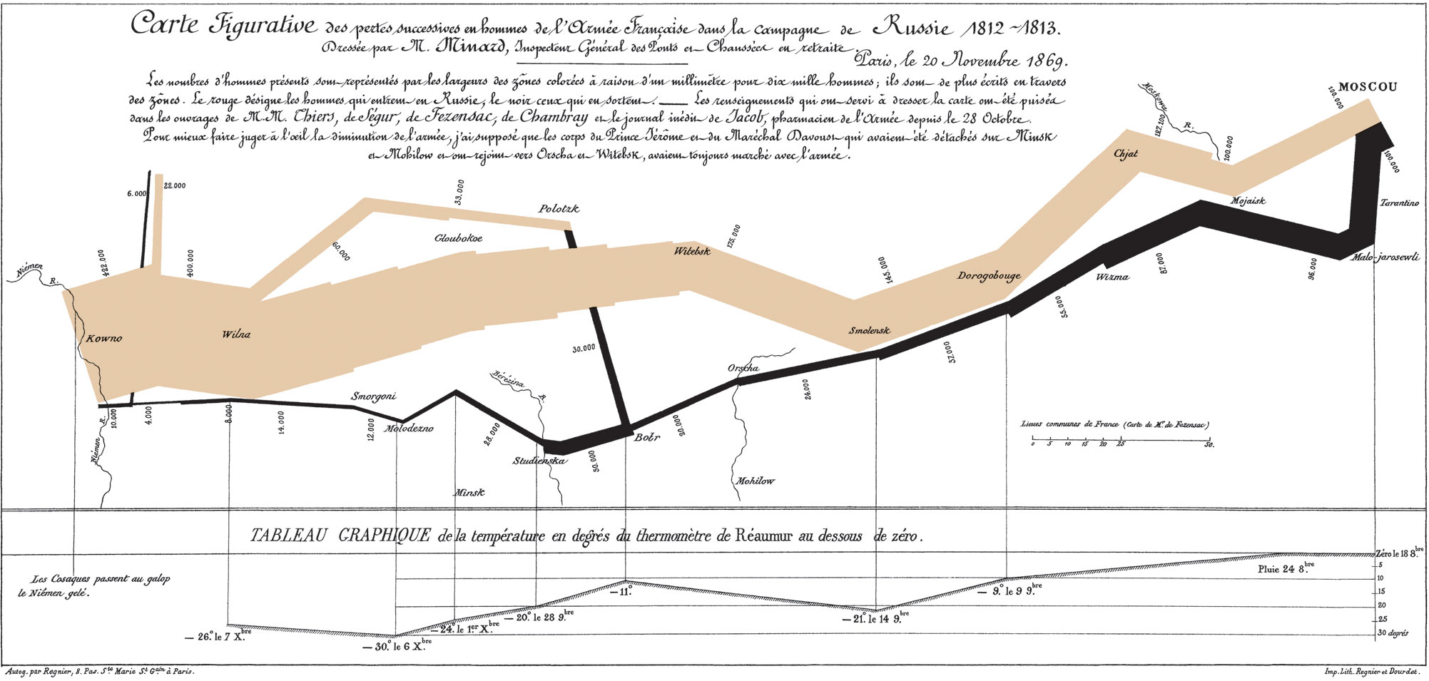 Charles Joseph Minard, Carte Figurative des pertes successives en hommes de l'Armée Française dans la campagne de Russie 1812-1813, 1869. Public domain.
From system to environment
Move forward a century and information design stops describing the world and starts organizing movement through it. Massimo Vignelli and Bob Noorda, working out of Unimark's New York office with Joan Charysyn as lead designer on the map, produced the 1970 New York City Transit Authority Graphics Standards Manual and the diagrammatic subway map that followed. MoMA acquired both in 2004, and the institutional history has a pleasing circularity to it, since the Transit Authority brought Unimark in during 1967 on the recommendation of MoMA curator Mildred Constantine. Millions of riders have never once considered that signage as artwork, and the indifference is the point. An exhibition about information design has every reason to examine the moment the practice became public infrastructure, including the standards, the typography, the compromises and the eventual withdrawal of the 1972 map under commuter complaint.
Gapminder marks the next transition, from fixed systems to software. Ola Rosling led development of the Trendalyzer engine and Anna Rosling Rönnlund designed the interface that made its animated bubbles legible to students who had never read a development statistic, with Hans Rosling supplying the public voice. Google acquired the tool in 2007. Vignelli made a complex city navigable, and Gapminder made a complex world navigable, but the second achievement raises a harder museum problem than the first. Institutions have centuries of convention for hanging prints and decades for screening film, and almost nothing for preserving and exhibiting interactive educational software as a cultural artifact worth keeping.
Richard Vijgen is the omission I found hardest to understand. His practice addresses precisely the world MoMA describes in its own wall text, the one built from invisible computational systems and wireless infrastructure. His WiFi Tapestry listens to the wireless activity in a room and converts it into current and heat, so that thermochromic yarn shifts between midnight blue and silver as the invisible traffic around the viewer forms and dissolves. Architecture of Radio does related work through augmented reality, rendering the cell towers, routers and satellites overhead as a visible landscape. A dashboard represents data about an environment, and Vijgen makes the environment of data perceptible, which would have moved the exhibition's definition from something visitors look at toward something visitors stand inside.
Erik Driessen points somewhere adjacent. The Dutch data artist builds generative visualization systems in code and turns them loose on ordinary material, converting the sentiment of an album's lyrics into flowing calligraphic forms. He has also published notebooks that help others rebuild Du Bois's data portraits from scratch, which closes a loop the exhibition opens. Driessen poses the aesthetic question underneath everything else here. At what point does a visualization stop visualizing and become the work itself? The exhibition need not answer that question. Raising it is precisely what makes this territory worth a museum's attention.
The exhibition that opened without its book
I was told at the museum that additional exhibition material was forthcoming but had not been ready for the opening. Two days later I can find no catalogue, book or substantial pamphlet, and none appears to be announced. MoMA's exhibition page lists no publication, and nothing turns up in the catalog of Distributed Art Publishers, which handles the museum's books. Visitors in the gallery get laminated section cards marked "Please return after use," each carrying a numbered checklist and a paragraph of context. Online MoMA has done considerably more, posting the introductory and section texts, extended labels and a short audio guide.
The absence is worth reading structurally rather than as carelessness. Nearly every work on view already belongs to MoMA, and the show occupies the free street level gallery rather than the upper floors, which suggests to me that it was planned and budgeted as a collection display. Collection displays are less likely to receive substantial catalogues. The qualification matters, because the museum's own recent practice shows this is a tendency and not a rule: Never Alone, the 2022 video game exhibition, occupied this same street level gallery, drew on the collection, and still carried a 140 page book. MoMA plainly can produce one for a collection based street level exhibition when it judges the publication worthwhile. The missing book, read that way, becomes another measure of the scale at which the museum chose to treat the subject, which is the same measure constraining everything else about the exhibition.
Something real is lost either way. Loose PDFs and an audio guide interpret individual works well enough, and none of that material makes the connective argument a catalogue makes, the one running Minard through Du Bois to Vignelli, Gapminder and the computational work now hanging on the walls. A book would also outlast June 2027 and give scholars something to cite, which matters for a field still arguing about whether it has a history at all. Edward Tufte settled that argument for a generation without any institution's help, mortgaging his house to self-publish The Visual Display of Quantitative Information in 1983 after the publishers turned him down. Tufte did more than almost anyone to make Minard's 1869 map famous among modern readers, placing it at the center of a canon he largely assembled himself and presenting it as a revolutionary piece of visual thinking rather than a historical curiosity. A field whose history was gathered by one man working outside every museum might reasonably expect the institution that has just declared the subject worth collecting to supply the next volume. The scholarship plainly exists here. It has not been gathered into a form equal to its subject.
What the full exhibition could look like
The strongest response is not a longer checklist of missing names but a different scale of exhibition, one given the space MoMA reserves for a major retrospective. A first gallery could begin with Minard, Du Bois, Harry Beck and early statistical cartography, setting original prints and working documents beside large reproductions so visitors watch designers discover how to turn population, geography, movement, time and loss into visual form. Minard's shrinking army leads to Du Bois's startling geometries and eventually to Warming Stripes, and the point is less historical than formal, since the same visual ideas appear, disappear and return generations later.
A second gallery could show information design becoming a system people inhabit. Vignelli and Noorda's subway work belongs there as an environment of signs, typography and standards rather than as a famous map, and a reconstructed station section could show how those decisions worked together at human scale. Nearby, a working Gapminder installation would let visitors move through two centuries of population and economic data instead of looking at screenshots. News graphics, election maps and weather displays would carry the same point into daily life. The subject in that room is not the chart but the infrastructure assembled out of charts, symbols and interfaces.
The final gallery could drop the expectation that information stays on a page or a screen. Vijgen's WiFi Tapestry would respond to the wireless traffic the gallery itself generates, Architecture of Radio would reveal the networks surrounding the museum, and generative work by Driessen and others would let datasets produce forms that never resolve into a finished image. Visitors would enter seeing information represented and leave physically surrounded by it. The progression runs from information represented to information organized to information experienced, or more simply from print to system to environment, and it would need the catalogue this exhibition lacks to hold the argument together, including essays on what a museum actually acquires when the work is an algorithm, a live dataset or software dependent on technology that will eventually fail.
A painter earns a retrospective because a visual language takes room to explain. Information design has now been granted the first half of that argument and not yet the second. MoMA has taken a first step into a much larger world. Thirty works in a free street level gallery cannot contain the subject MoMA has just declared worth collecting, and the exhibition is more persuasive about that than any critic could be. Full Disclosure should not be remembered as MoMA's definitive statement on information design, but a starting point of a rich body of work.

At the Museum of Modern Art, New York, with Andy Warhol, Campbell's Soup Cans, 1962, acrylic with metallic enamel paint on 32 canvases. The Museum of Modern Art, New York. Photograph © 2026 Elmer Yglesias. Artwork © 2026 Andy Warhol Foundation / ARS, New York / TM Licensed by Campbell's Soup Co. All rights reserved. Photograph used in the context of commentary on the museum visit.
Further Reading
- Full Disclosure: The Edge of Information Design - MoMA, through June 13, 2027, Floor 1, 1 South, free and open to the public. Carries the curatorial statement, the accessible gallery handout and a four part audio guide. It lists no publication.
- Full Disclosure press kit and exhibition materials - MoMA press office. The checklist, the gallery handout, the introductory text, four section texts and the extended labels, all free. Read together they are most of a catalogue, distributed as loose files.
- Calculating Empires: A Genealogy of Technology and Power Since 1500 - Kate Crawford and Vladan Joler’s interactive visualization tracing five centuries of relationships among technology, power, communication, classification and control.
- The Graphic Works of Charles Joseph Minard - Michael Friendly's catalogue of every known Minard map and graphic table, compiled from the holdings of the École nationale des ponts et chaussées and the Bibliothèque nationale de France. The 1869 Carte Figurative is the last sheet of the portfolio Minard presented to the ENPC himself.
- The Visual Display of Quantitative Information - Edward Tufte, Graphics Press, 1983. Still sold by the press he founded to publish it after the trade houses passed.
- Gapminder - the interactive lineage discussed above, still running. The biographies page is the plainest correction to the popular account: Ola Rosling led the Trendalyzer build and Anna Rosling Rönnlund designed the interface that made it legible.
- Never Alone: Video Games and Other Interactive Design - MoMA, 2022. The counterexample in the catalogue argument above. Same street level gallery, same curator, drawn from the collection, and it carried a 140 page book.
AI Assistance Statement ▾
A near daily publishing pace is possible because AI tools do a substantial share of the work between the idea and the published text. Preparation of this entry included assistance from Anthropic's Claude and from OpenAI's ChatGPT (GPT-5 series reasoning models). I use them to research a topic and gather primary sources, to organize ideas and propose structure, to draft and revise prose, to check factual claims against the cited sources before publication, and to score drafts against a set of house style rules. Longer pieces are often developed across several sessions. A written handover carries the argument, sources, and open questions from one session to the next, and the same tools help prepare those handovers. The tools also help identify candidate images and confirm that selected images appear to be released for reuse, for example through public domain or Creative Commons licensing.
A fuller explanation of the editorial process appears in How I Use AI to Write This Blog. This process is also an AI experiment in its own right. There is a live argument about what AI-assisted writing does to originality, and whether the result is thought or slop; a noteworthy example is the August 2026 dispute over a Wall Street Journal op-ed that its author acknowledged drafting with AI, and the Journal's subsequent defense of the practice (WSJ is behind a paywall, but for a public summary: click here, and here). I would rather run the experiment openly than pretend it is not happening. This blog is one sustained attempt to find out whether a person with an argument, working with these tools every day, produces writing that is still recognizably that person's, and I disclose the method so readers can judge the result.
The judgment is mine. I choose the topic, decide the argument, supply the personal and professional experience the pieces draw on, read and edit every draft, verify the sources and image licensing, and take full responsibility for the final published content. Where a post contains my own recollections, the AI did not invent them.
Statement revised September 2026.